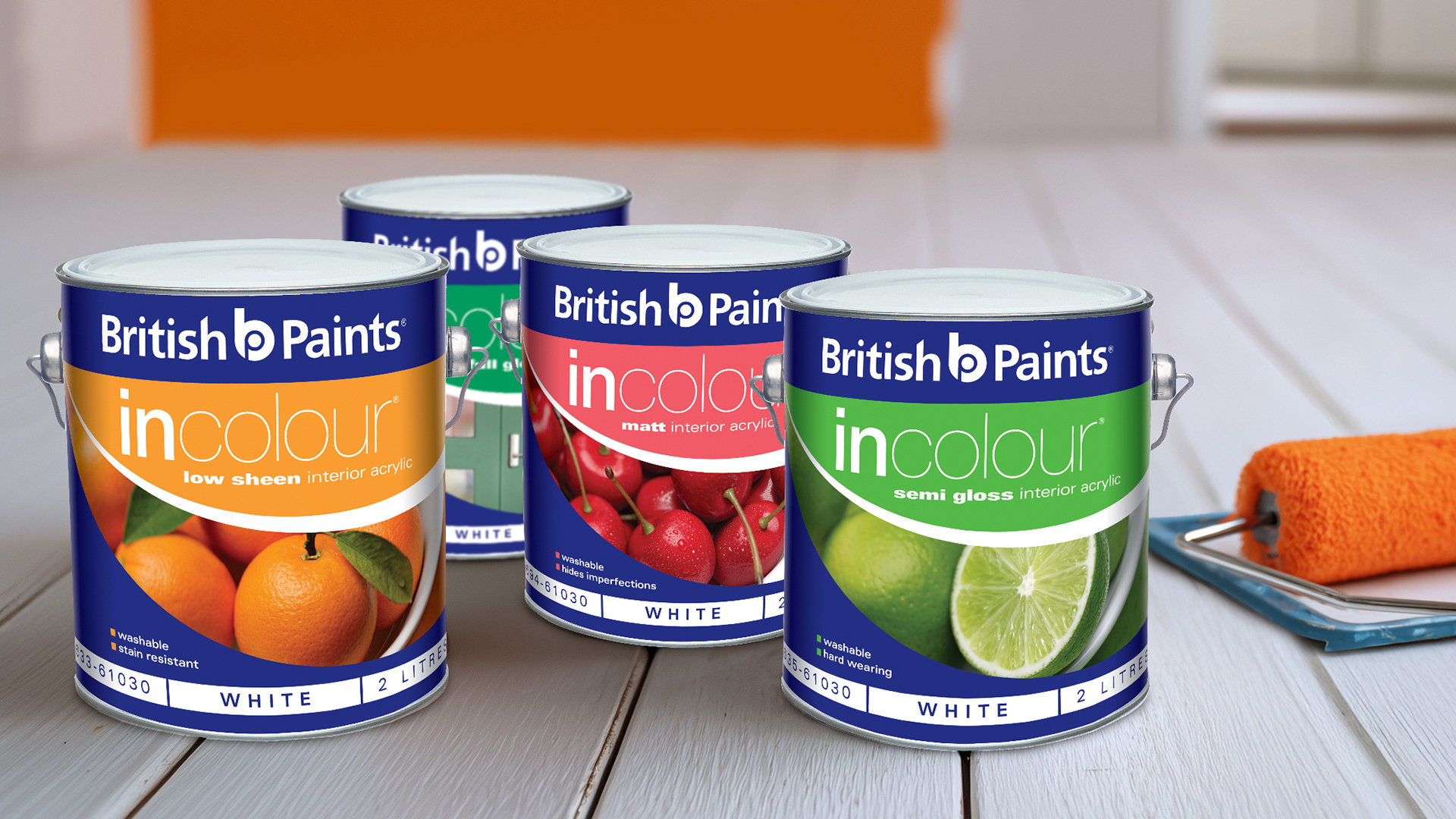
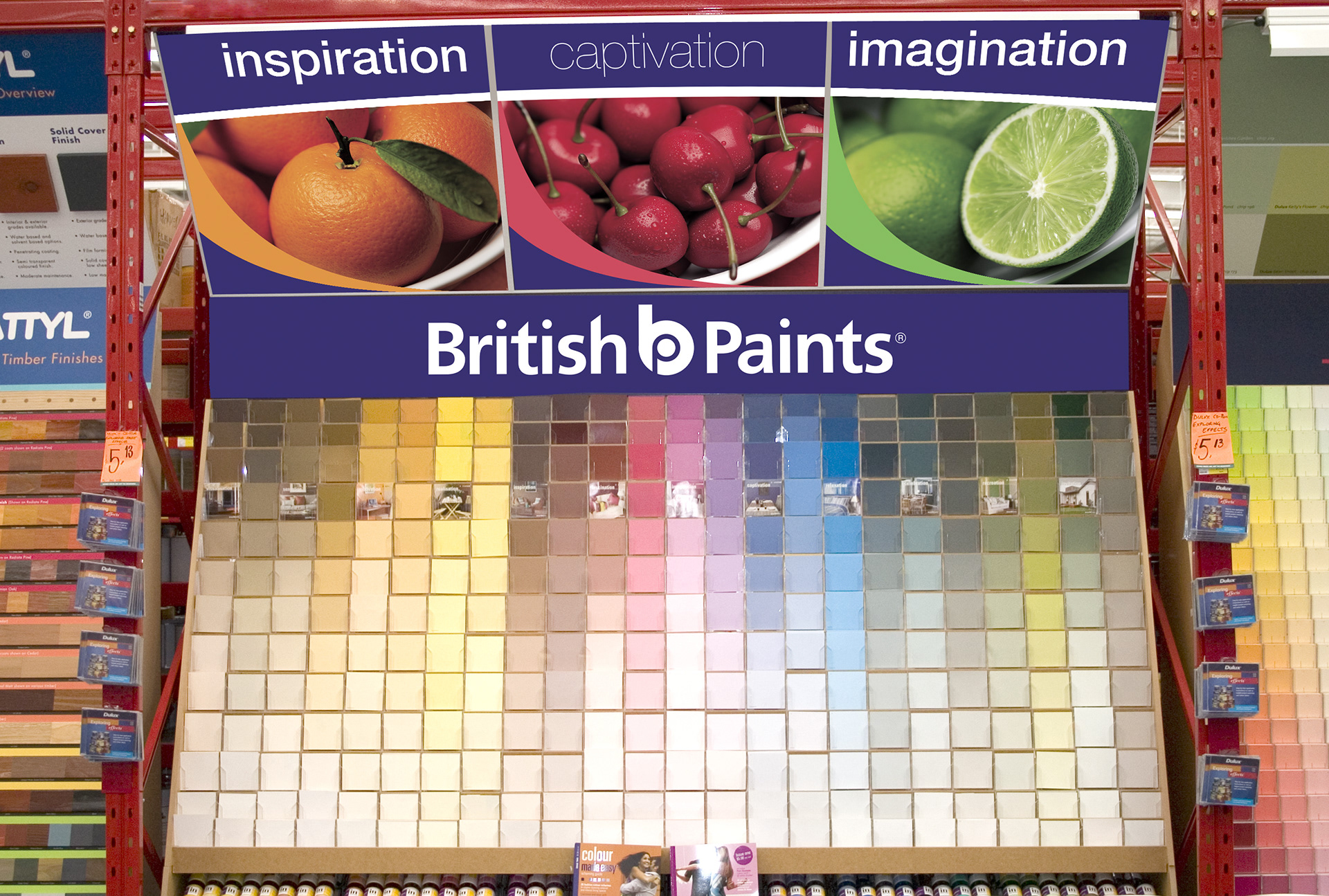
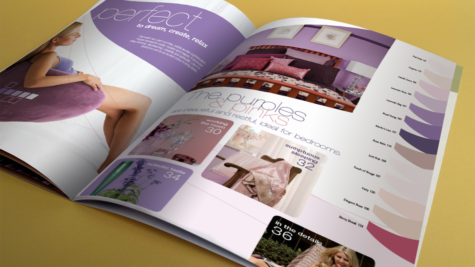
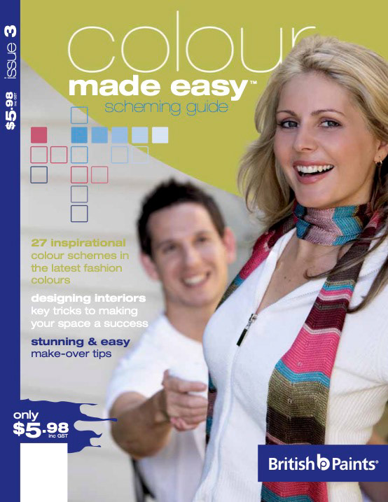
Revitalising the British Paints brand was an exciting challenge that repositioned the range to connect with the growing female DIY and renovator market. Beyond refreshing the tins with a bold new look, the brand extended into the Colour Made Easy magazine; filled with tips and inspiration for home makeovers.
The project brought together painters, homeowners, photographers, and our design team to create a cohesive, vibrant identity. The response was immediate, during approvals, customers were already picking mock-up tins off the shelf.
Results: British Paints successfully fended off competitor Nippon and secured the Bunnings account, strengthening its position in the market.
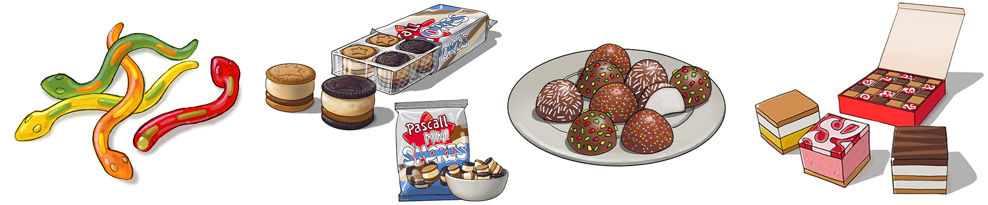
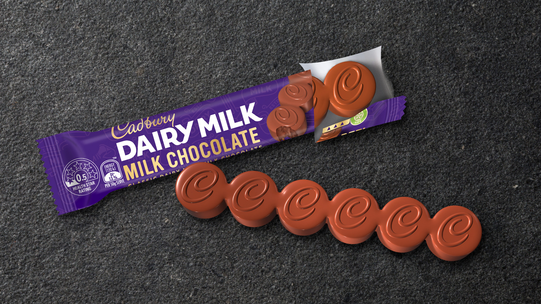
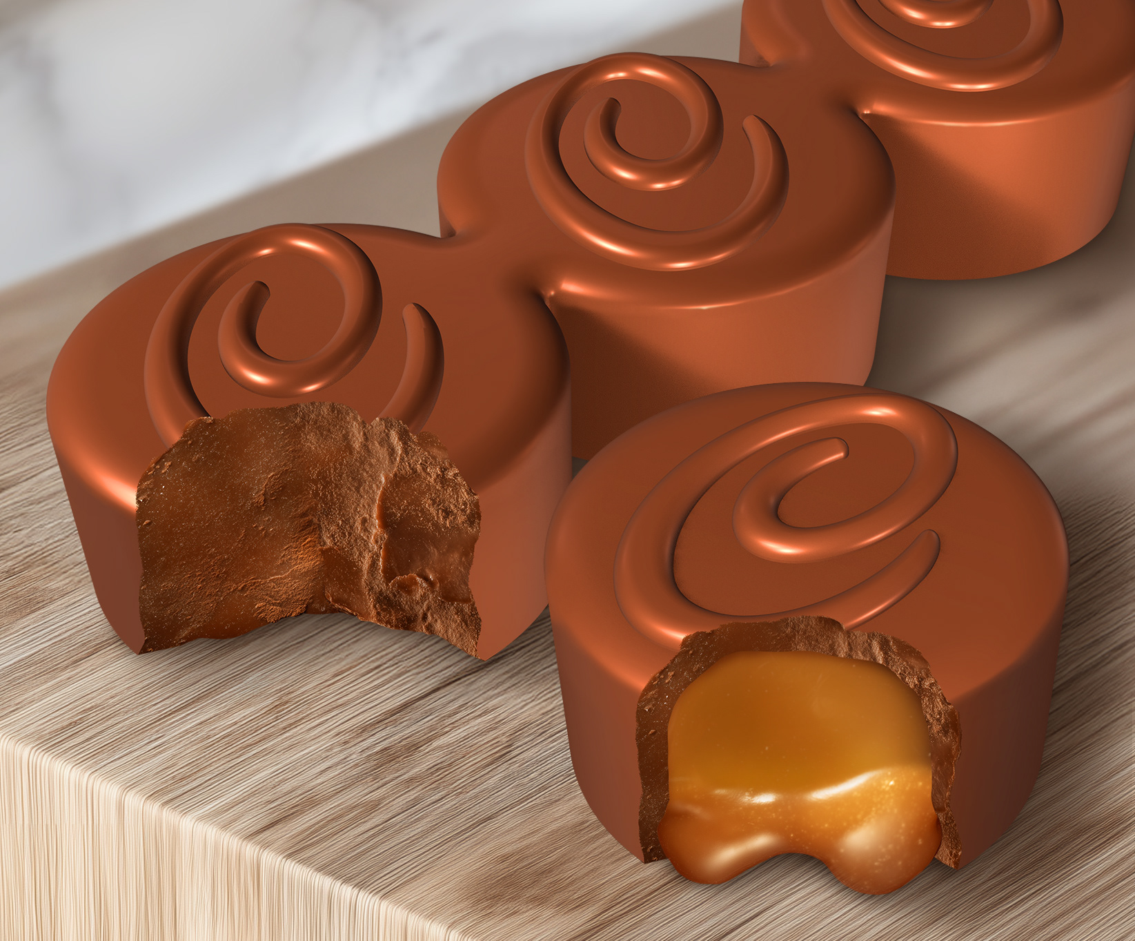
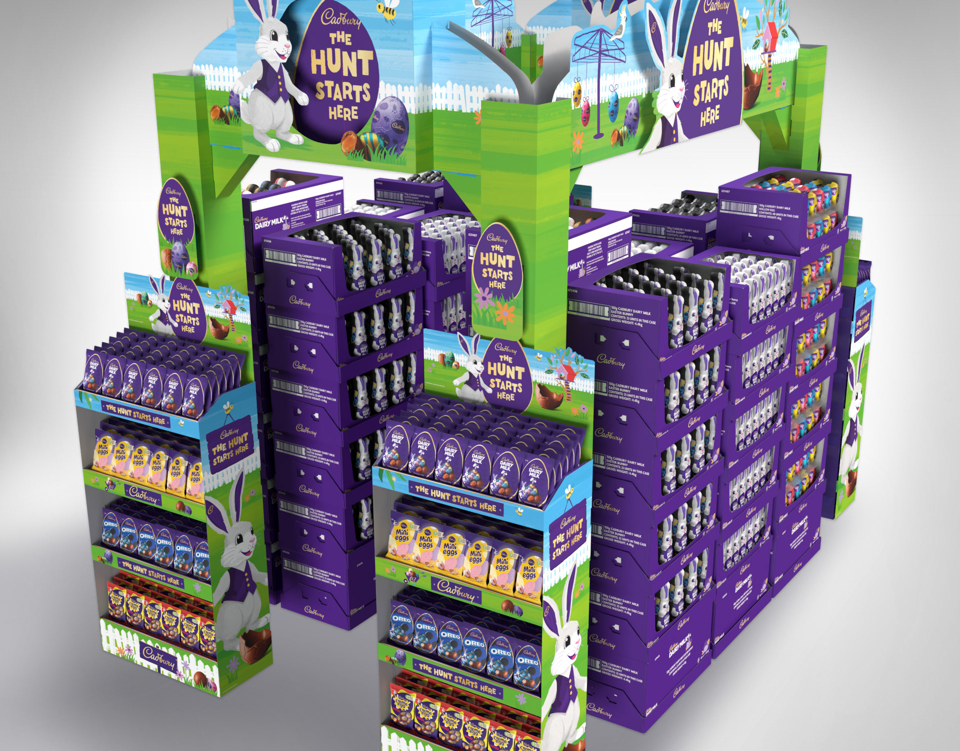
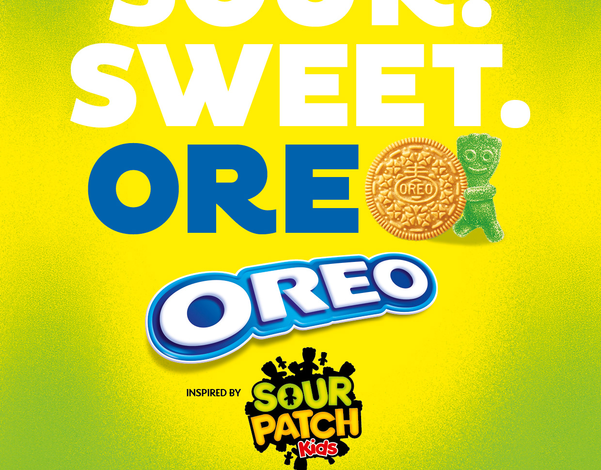
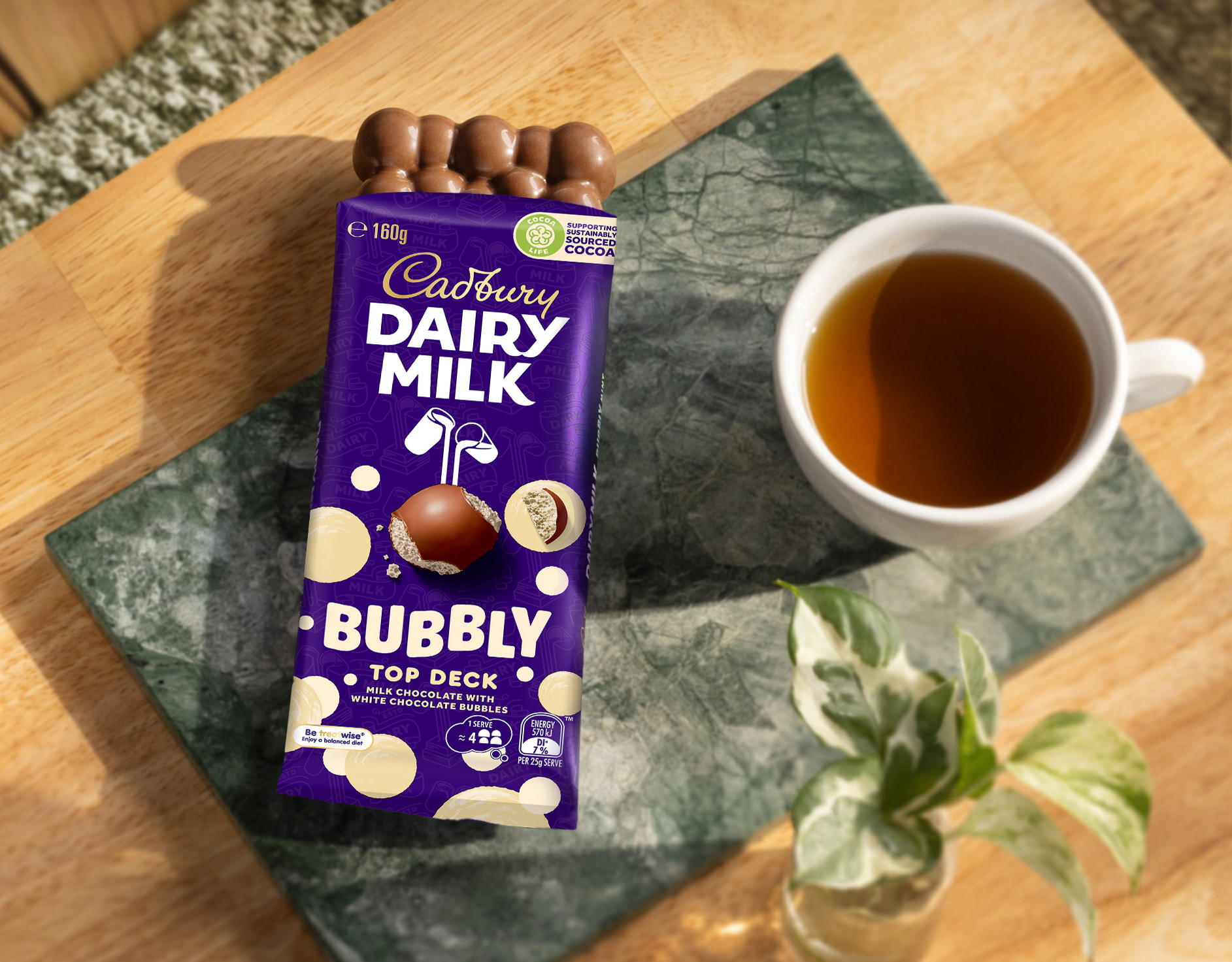
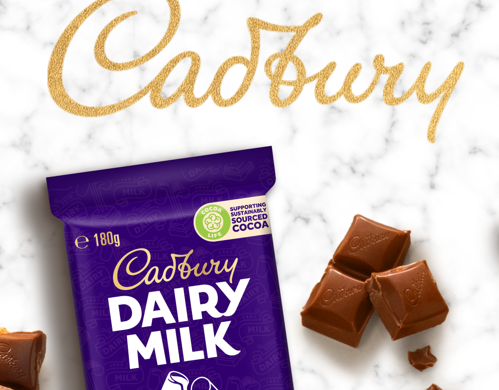
Chocolate is the ultimate FMCG product — fast-moving, fiercely competitive, and always under pressure to innovate. I’ve collaborated with Mondelez brands on numerous ideation projects, from early concept sketches to 3D product modelling and everything in between.
Results: Helping Cadbury, Pascall, and other brands visualise, sell in, and green-light new products and brand extensions.
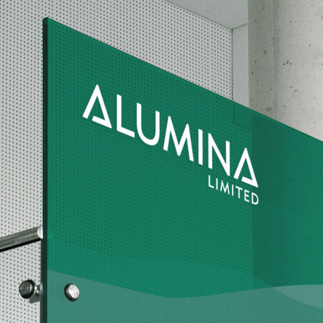
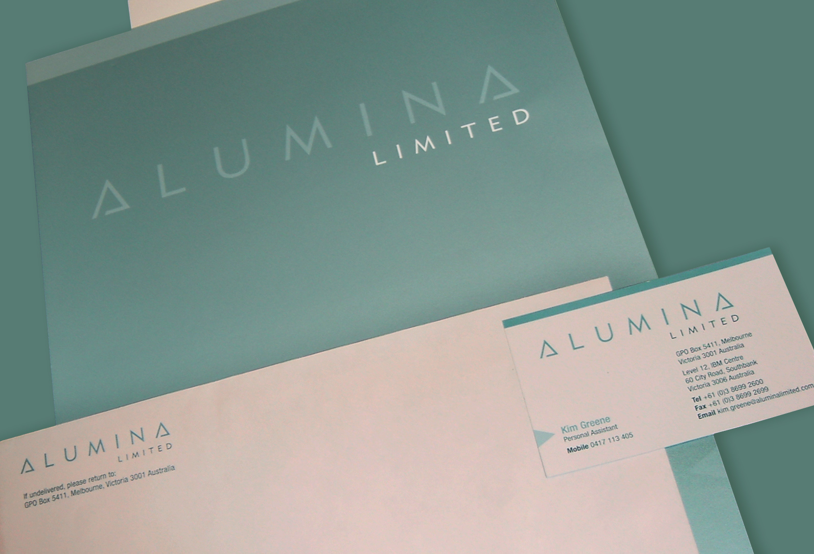
When WMC spun off Alumina Limited, the task was to create a brand identity that would position the new company as a strong, confident player in the global mining sector.
Results: A timeless, minimal look with contemporary detailing, supported by a suite of design elements and glyphs that extended the brand seamlessly across multiple applications.
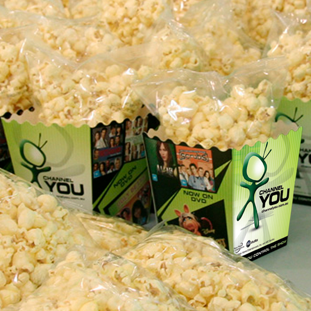


In the final days of DVD, Disney set out to create a brand that bundled its TV series and championed media ownership in the face of streaming. Channel You, where you control the show, became an in-store destination with a playful mascot and a fresh, inviting look.
Results: Disney retained premium retail space in JB Hi-Fi, Big W, and other stores, with strong consumer response to the multi-season DVD collections.
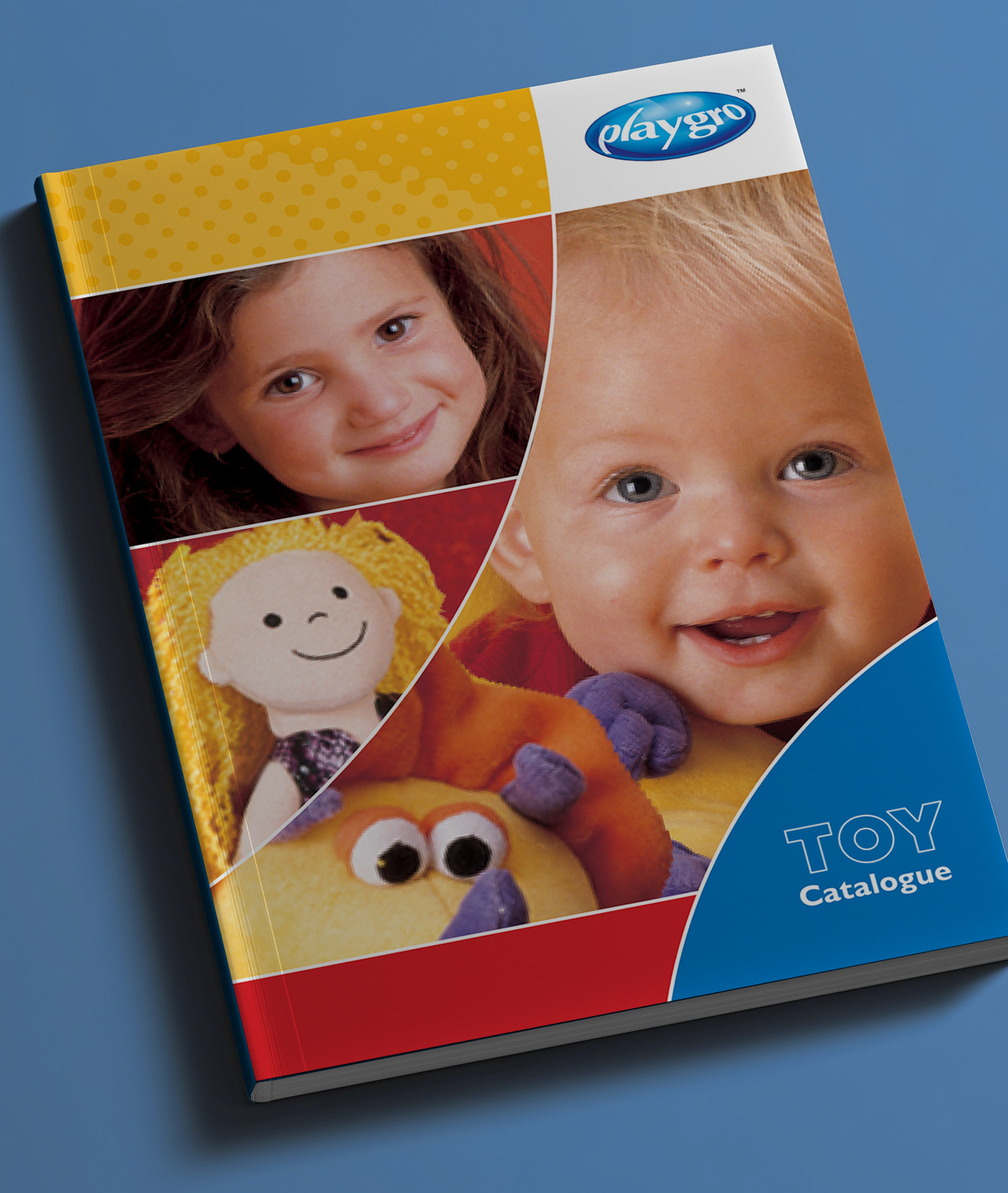
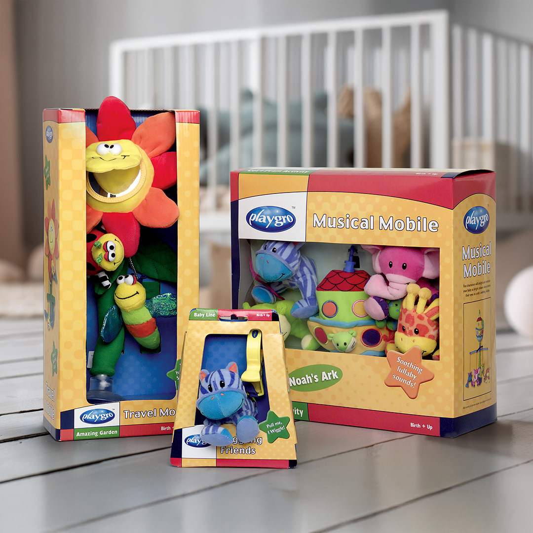
Playgro is an infant-focused toy company, and developing their brand extended across packaging, advertising, and catalogue design. The look was bright, playful, and full of colour with packaging that dominated shelves and perfectly showcased the charm of the toys. The catalogue required photography with infant talent (and plenty of patience), but the result was a fresh, cohesive look that helped elevate the brand to the next level.
Results: Packaging that stands confidently alongside global competitors, supported by brand elements designed for consistency across a wide range of shapes and sizes.
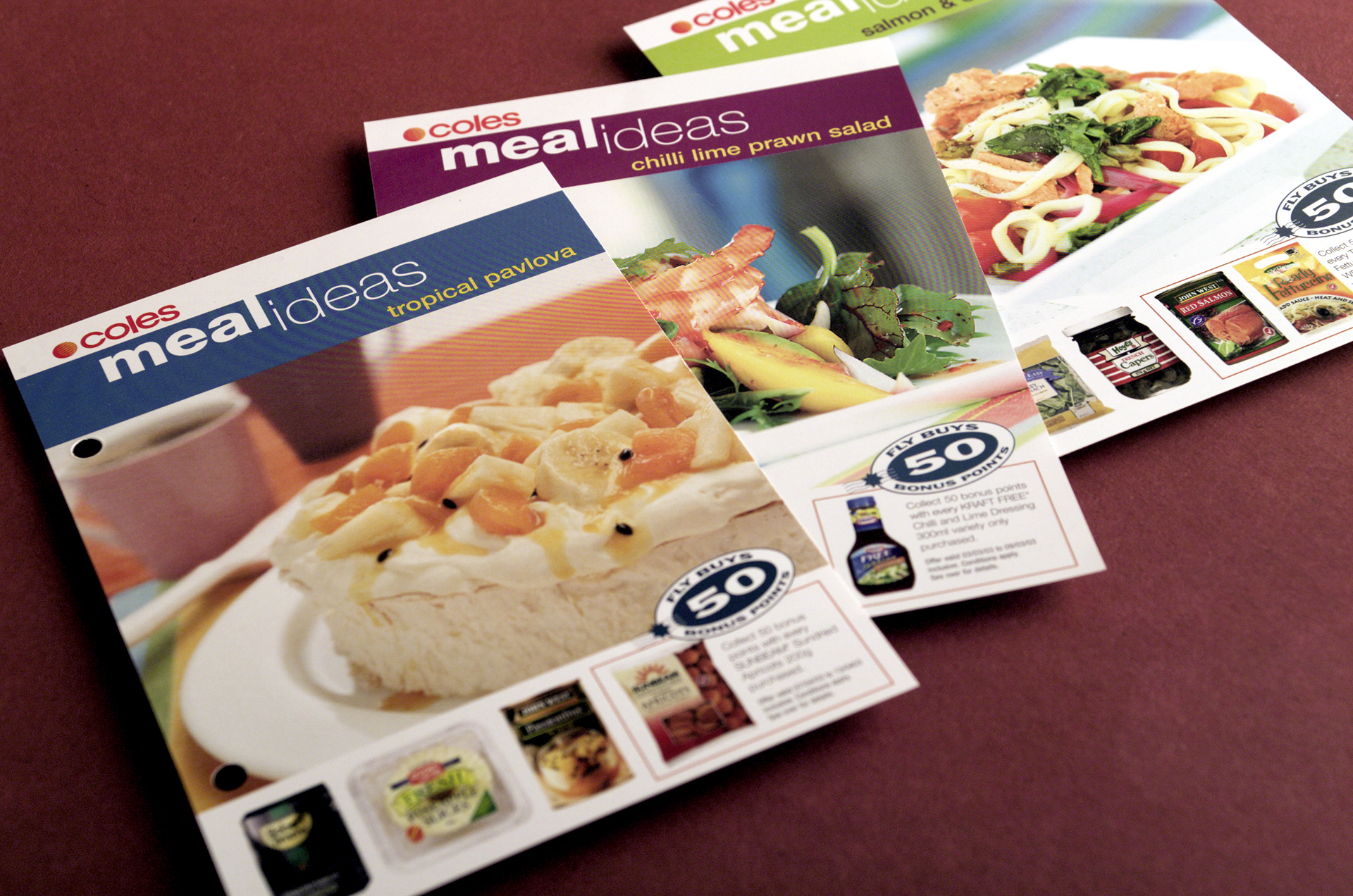
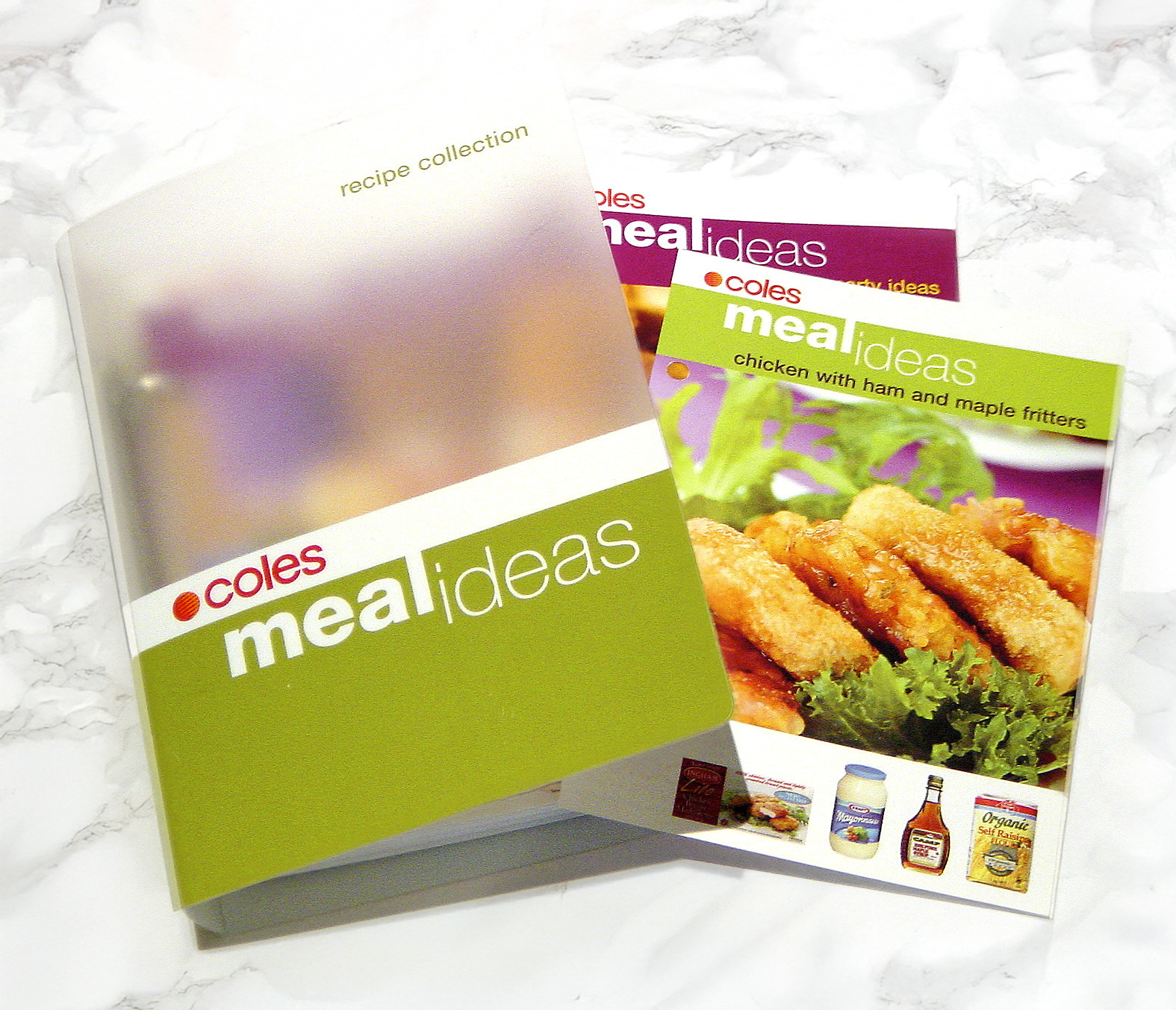
Coles Meal Ideas was a long-running recipe series that brought easy, inspiring meals to millions of shoppers. The project was an exciting opportunity to create a visual system that balanced multiple photos, products, and ingredients while maintaining a cohesive brand identity.
Results: CMI ran successfully for many years across hundreds of recipes and seasonal editions. It also provided an additional marketing platform for food brands that might not otherwise have gained exposure.
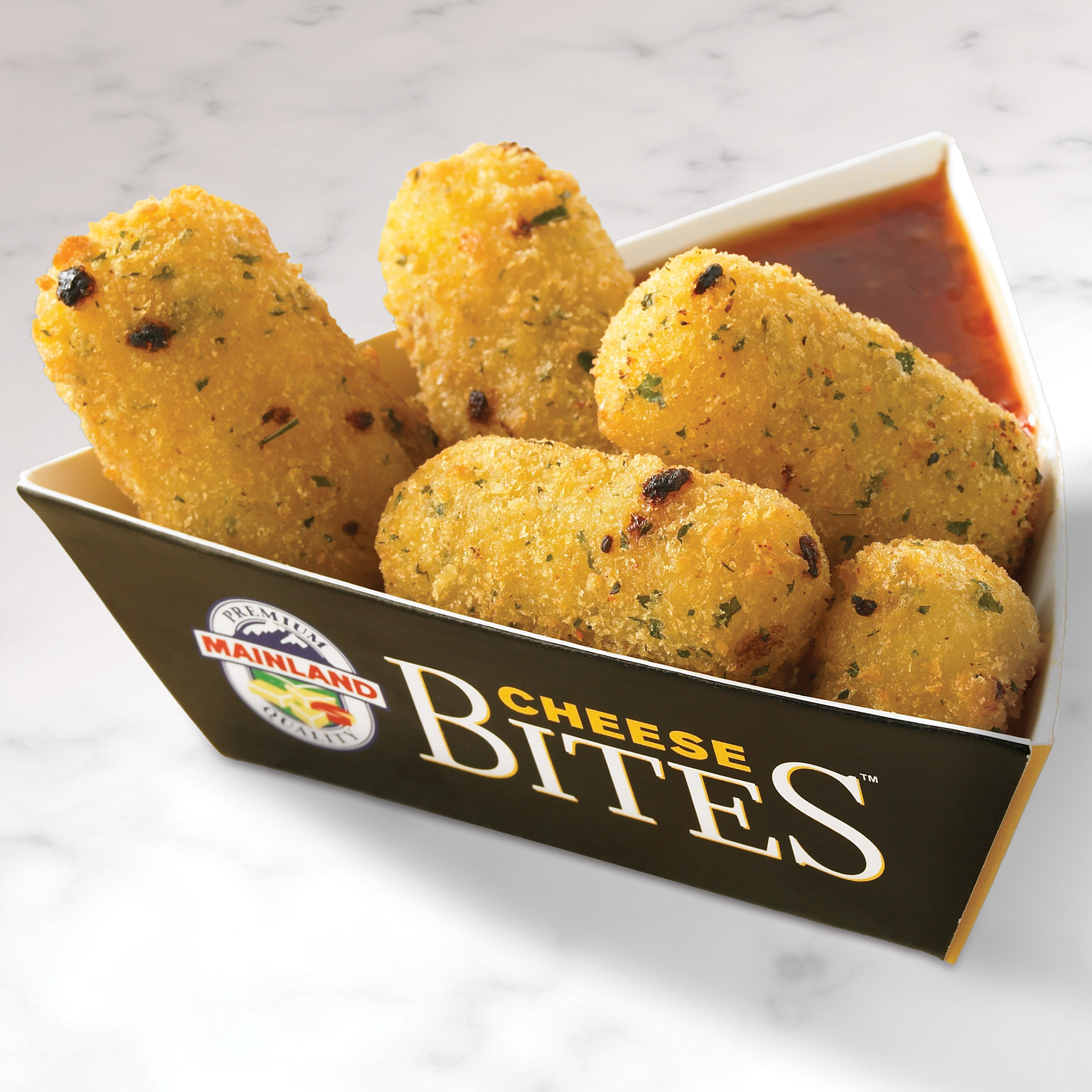
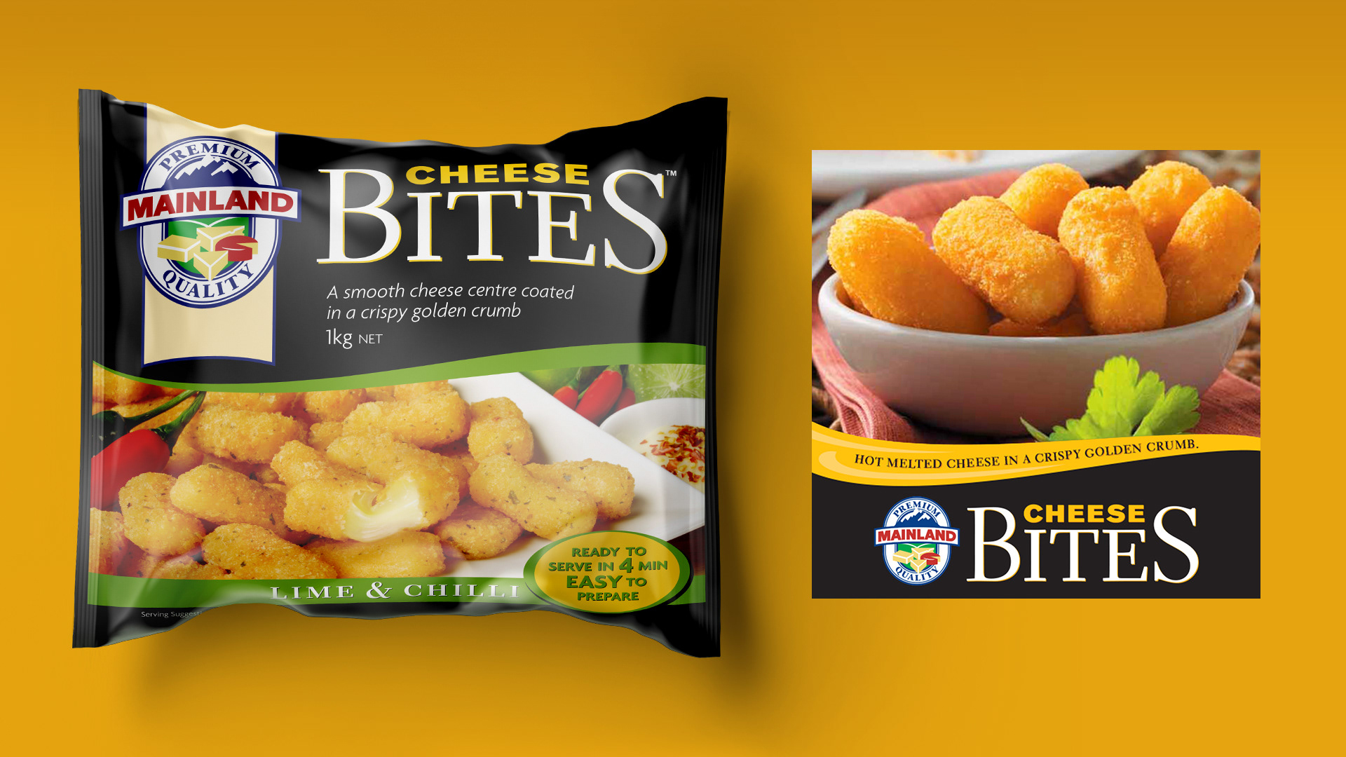
Fonterra launched Cheese Bites into the HORECA channel with a range of crumbed cheese snacks in multiple flavours. The brand was designed to bridge B2B and consumer-facing environments, creating an appetising, moreish identity that looked as good on a menu as it did in the venue. The campaign extended across brand development, packaging, advertising, and launch events, positioning Cheese Bites as the perfect company for beer and wine. I also designed a custom serving tray to hold the product alongside dipping sauces.
Results: Cheese Bites were enthusiastically received, achieving strong sell-in across RSLs and major HORECA venues.